These are the final estimated support levels as calculated on November 3, 2020. This model run uses individual polls dated from January 1 to November 3, 2020.
 |
 |
|
| Joseph R. Biden | Donald J. Trump | |
| Campaign Website |
Campaign Website |
|
| 364 | Electoral Votes |
174 |
| 323 to 420 | Confidence Interval |
118 to 215 |
| greater than 99-to-1 in favor | Current Odds |
|
Final Electoral Maps
The following are three maps of the United States with each electoral division colored according to the candidate support level as estimated on November3, 2020. The differences reflect three possible turnout scenarios. The bar at the top represents the current estimated Electoral College votes for the two candidates. The triangle beneath it is at 269, which is 50% of all electoral votes. Its color indicates the estimated winner of the vote. Remember that the number of Electoral Votes is not related to the state’s area; it is related to its population.
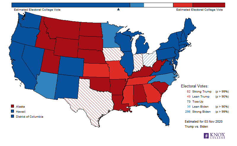
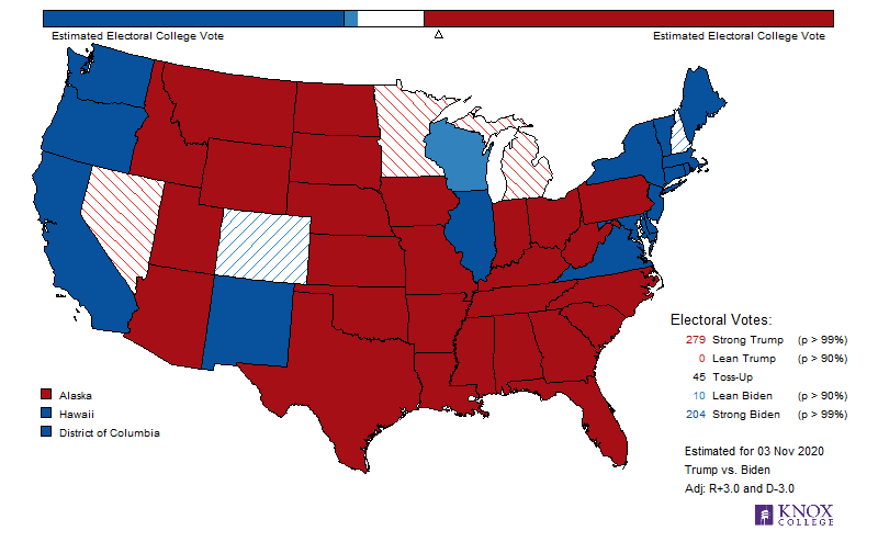
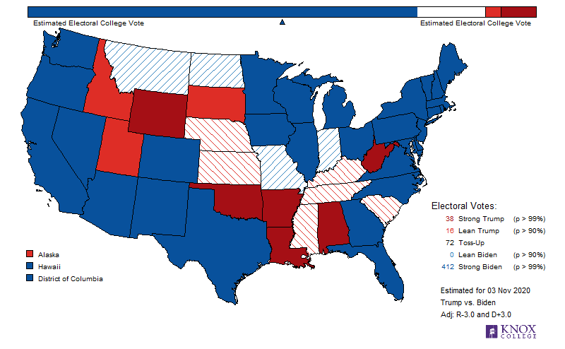
Remember that the United States of America uses an elected Electoral College to determine the next president. This Electoral College is selected at the state level (history). States with more electors have higher populations; those with fewer have lower. The state with the most electors is California, which has 55 Electors (Texas, the second, has 38). The states with the fewest have three (Alaska, Delaware, District of Columbia, Montana, North Dakota, South Dakota, Vermont, and Wyoming).
To examine a specific state,
Electoral Estimates over Time
Electoral support is not constant over time. The following graphic illustrates this. Again, the darker colors indicate higher probability of the electoral vote going to that candidate, with Vice-President Joseph Biden in blue and President Donald Trump in red (click image for larger version).
The dark colors represent electoral votes that we decide are currently “safe,” light colors are those that we decide are “leaning,” and grey are those electoral votes we consider “toss-up.” The horizontal line at 269 represents the “minimum needed electoral votes” for a win. Thus, if the 269 line is currently in the dark part, then this model indicates very strong evidence that the candidate will win. If the line is in the grey part, then the election is a toss-up. The color reflects the traditional (post-1996) use: blue for Democratic, red for Republican.
Electoral Vote Distribution
In the United States, the president is elected by the Electoral College, which is elected by the people in each of the 50 states (plus DC). Our model estimates the probability of the candidates winning each state. By using Monte Carlo simulation, we are able to provide a distribution of the number of electoral votes the candidate would be awarded were the election held on November 3, 2020 (click image for larger version). The following provides this graphically.
This graphic illustrates the likely outcomes in the electoral vote (EV) resulting from the election. The height of the bars represent the relative probability of that specific number of electoral votes. The horizontal bar in the lower margin is a 95% probability interval for the EV count. In other words, 95% of our simulations had President Trump earn between 118 and 215, inclusive (269 are needed for a win). The triangle represents the median of the distribution, and the dot represents the mean of the distribution.
Estimated State Support Distributions
The following graphic more-clearly illustrates the level of uncertainty in our estimates. The wider the curves, the greater the level of uncertainty. The vertical white dashes are the current “best guess” in each state. The black plus signs indicate how the state voted in the 2016 election.
Note that one can infer the level of certainty (precision of estimates) by examining the width of the curves. Wider curves indicate a much higher level of uncertainty. Wide curves can arise from a couple of ways. The first arises from having little data. If few polls have been done in the locality (e.g., DC, HI, and WV), then the curves will be much wider.
The second is from having data that is highly variable (e.g., IA). In such a condition several recent polls are taken, but their estimates differ a lot from each other. This conflicting information suggests that the electoral is uncertain in who they prefer.
To examine a specific state,
Previous Elections
This model is largely the same as my original model used in the 2012 election. Here is the final lowess graphic for that election. Note that the final estimate had the election as a toss-up, meaning neither candidate had more than an 80% chance of winning.
Our final estimate was run on Election Day, November 8. It gave Donald Trump a 1-in-5 chance of winning the election (4-to-1 odds against). In other words, the model did not view a Trump victory as a surprise. Also note the rapid change in support following the Comey announcement regarding the reopening of the email probe against Secretary Clinton on 28 October 2016.
Follow @Forsberg370